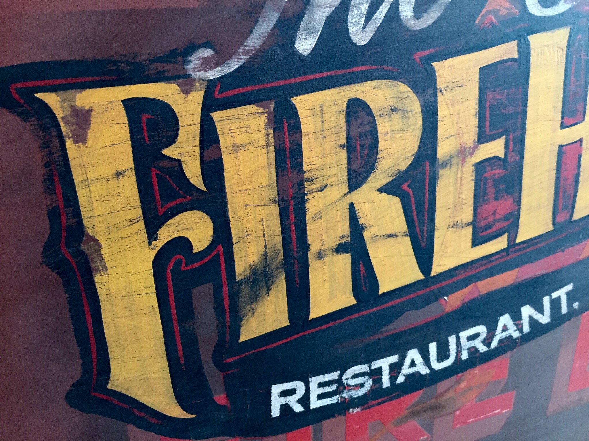
Custom signage with period design & unique creativity.
When Ion Graphics was still operational, Matt had the opportunity to do quite a few “vintage style” signs, most of which are still in service today.
It wasn’t the computer-aided signs that excited Matt but rather, the hand-painted – hand-crafted signs.
Matt is still known to take a sign order here and there and as long as it is something that appeals to his creative passion, he will joyously tackle the job.
If you have a sign project you would like to have done by Matt, feel free to contact him today!

Brewpub sign
This was a first for our area. A vertical period style design with modern functionality. This sign is a full custom steel sign with custom bent GE Tetra® Contour LED neon tubing. We made custom jigs to bend each letter. The result is a period correct look with modern functionality.
Featured in Summer 2020 issue of Gnarly Magazine #8 - AND - Sign Craft #233 July, 2020
Client
San Luis Valley Brewing Co.
Year
2013
BBQ Sign
From logo to complete storefront, This project used every service offered.
Logo, menu, signs, and displays all completed “in-house”. The logo was the brain child of the owner’s father and himself. They definitely wanted a pig as the mascot, but also wanted him to pop through the “Q” of the logo. Because they are a serious competition BBQ team, they wanted the design to be playful and professional. The signage was a play on backyard BBQ with a carnival style feel. All these styles play off of each other and this is what we end up with.
The design was also featured in Sign Craft Magazine #233 July, 2020
Client
Woody’s Q Shack
Year
2016
Tattoo Sign
This was a “fun-size” light-up arrow sign. The owner just wanted us to use our creativity to come up with a vintage style sign that boasted the feel of a tattoo shop. Marquee style lights were used atop of a custom steel case. The result is definitely fun and magnetizing.
Client
Fancy Rooster Tattoo Shop
Year
2017
Coffee Shop Sign
This was our 4th “Main Street” sign and we wanted to make this one extra special. We knew we wanted another vertical sign, and we also wanted to keep it a bit whimsical, so we came up with the idea of dumping coffee down the length of the sign into a giant coffee cup. We drew a couple designs (one modest and classic and one with our whimsical design) to our delight, the whimsical design was chosen and we immediately got to work!
Sign was featured in Sign Craft #233 July, 2020
Client
Milagros Coffee Shop
Year
2015
Dental Sign
Yet another fun, whimsical sign! The client wanted to use their child’s drawing of teeth in the logo. We took cues from the name they wanted as well as the child’s drawing and came up with what you see. A fun, candy shop (non threatening) feel for a children’s dentist! Steel inner-working with HDMU sign foam carved into a lollipop topped off with hand painted detail.
Sign was featured in Sign Craft #233 July, 2020
Client
Sweet Tooth Dentistry/Alamosa Dental Surgery Center
Year
2013